

The SprintFit
AI Copilot for Data-Driven Investors & First-Time Founders
*Now known as Siieve.Ai by TheSprintFit
TheSprintFit is a two-sided platform for early-stage startup investing. Investors get “Thesis Fit™,” an AI-assisted, thesis-aligned deal flow and rapid pre-diligence. Founders get “Origen Fit™,” a structured path to validate PMF, move from idea to MVP, and match with the right investors. I redesigned the public landing experience end to end, with a singular goal: make the story unmistakably clear and drive qualified beta trial sign-ups.
Overview
Manager
Kruti Baires
Internship Timeline
Jan - May 2025
Tools
Figma, Fig Jam, Loveable, Cursor, Framer
Skills
Problem Solving, UX Content Writing, Prototyping, Wireframing, Design System, Design Specs
My role
Product Design Intern
What does The Sprintfit do?

TheSprintFit democratizes early-stage investing by introducing a standardized, AI-driven evaluation system that levels the playing field for founders, investors and advisors. We are building the first-of-its-kind investment intelligence platform that applies data-driven evaluations to early-stage startups bringing transparency, fairness, and efficiency to the funding process.

PROJECT OVERVIEW

How might we help users understand what makes The SprintFit unique clearly communicating its purpose, the problem it solves, and how its data-driven approach creates value for investors and founders?
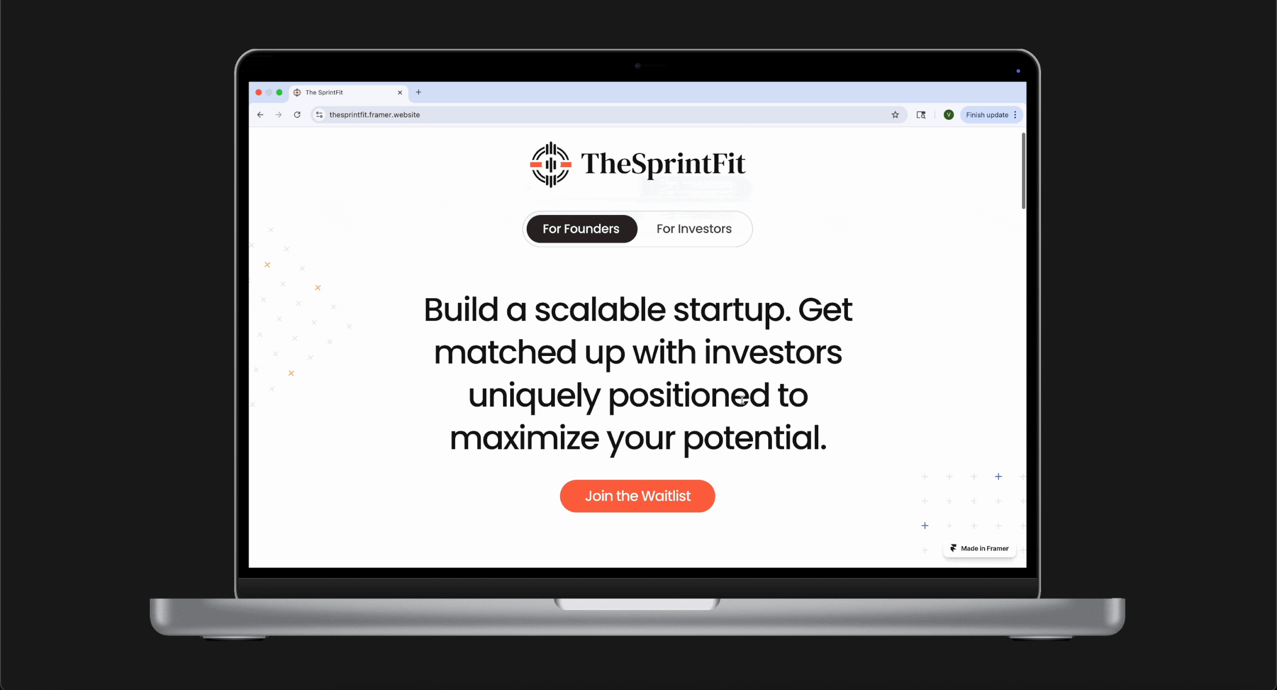
Original Design
Revised Design
USER PAIN POINTS


BUSINESS AND STAKEHOLDER CONCERNS
PROJECT GOALS
How can we make The SprintFit’s story clear and compelling within seconds? We set out to communicate the problem and value upfront, spotlight our predictive, data-driven framework as the key differentiator, and simplify the journey to the beta CTA while balancing two distinct audiences by creating a unified, focused narrative for both investors and founders.
ITERATIONS
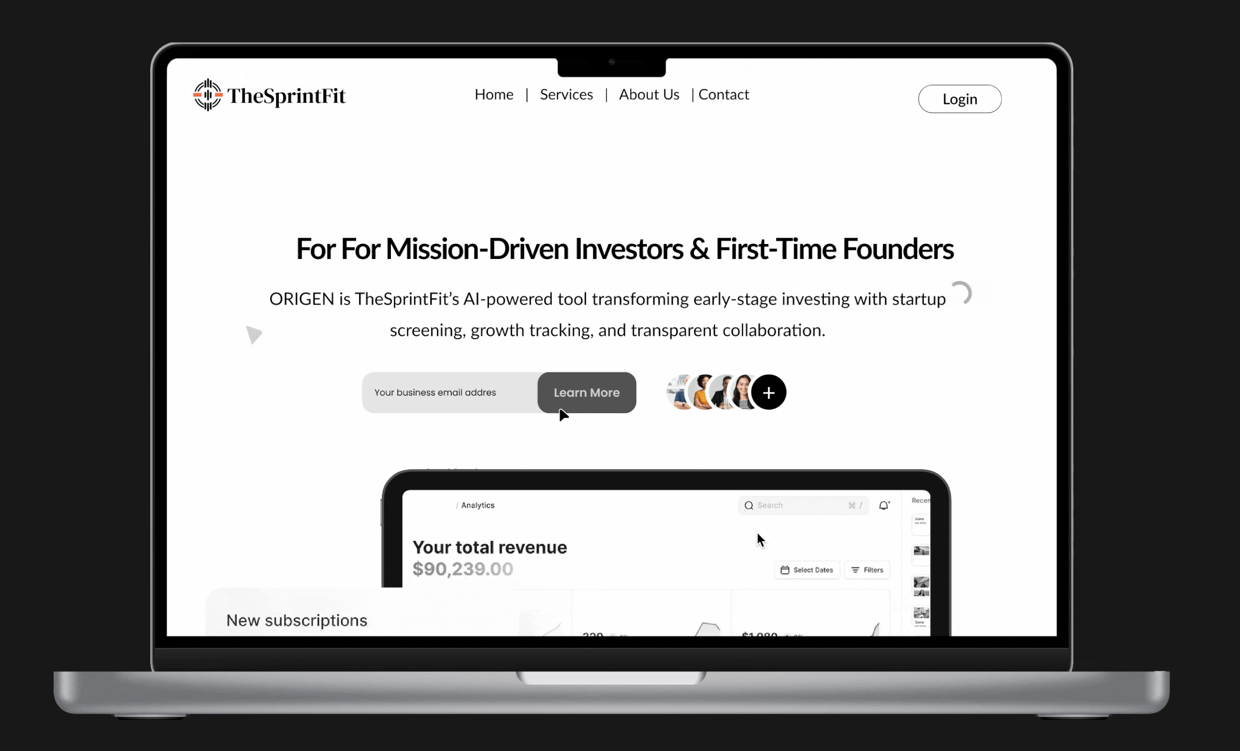
Design Decisions & Iteration #1
What worked well?
• Clean, modern layout that conveyed credibility.
• Neutral palette built trust and professionalism.
• Social proof near CTA added a sense of traction.
What didn’t work?
• Headline too broad and lacked clarity.
• Language felt generic and impersonal.
• CTA placement missed urgency and context.
• Visuals didn’t connect clearly to the core message.
Key takeaway:
Validated the tone and trust, but revealed the need for sharper storytelling, clearer hierarchy, and stronger visual alignment with value.
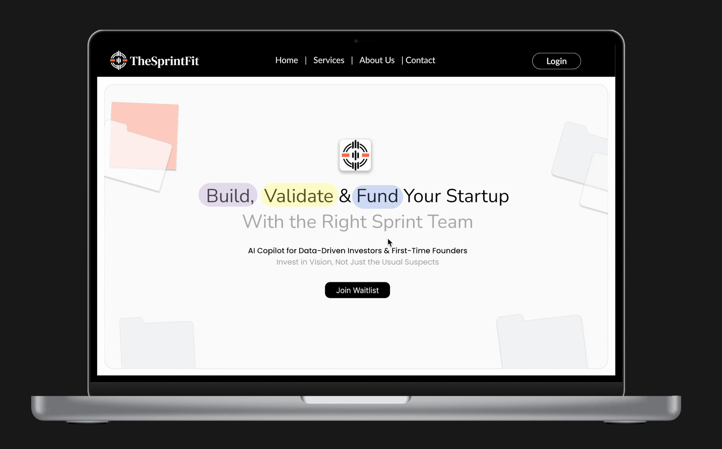
Design Decisions & Iteration #2
What worked well?
• The new headline immediately clarified purpose and audience.
• Color-coded words added hierarchy and drew attention to key actions.
• The single, bold CTA created a clearer conversion path.
What didn’t work?
• The colored highlights, though playful, slightly reduced visual contrast and accessibility.
• Supporting text still felt abstract to users.
• The hero lacked supporting visuals or context to communicate product functionality.
Key takeaway:
This iteration improved clarity, tone, and focus but still needed stronger narrative depth and visual storytelling to connect users to the product experience.
Design iterations and revised narrative
Across 10 rounds of design iterations, we refined both narrative and visual direction through continuous testing and feedback. We experimented with different bento layouts (3-box, 6-box, and stat-only versions) to balance storytelling and visual hierarchy. The color palette evolved from a cool blue to warmer tones of purple, green, and beige to convey approachability and trust. We also tested dark vs. light themes, refined the hero copy for clarity, and optimized CTA placement to ensure the story flowed naturally and conversion points felt intuitive.

FINAL DESIGN

For the final design, we focused on refining clarity, flow, and visual hierarchy based on user feedback from earlier iterations. Testers wanted a smoother first impression, clearer entry points, and stronger cues connecting the story to action. We simplified the hero narrative, improved CTA visibility, and balanced content density to keep users engaged longer. The outcome was a cohesive, high-converting experience that felt intuitive, trustworthy, and aligned with The SprintFit’s data-driven identity.


Every design choice was guided by user testing and engagement data. For example, the revised hero section hierarchy emerged from A/B testing that showed users were missing key messaging, leading to clearer copy and CTA placement. I collaborated closely with the engineering team to ensure animations and responsive layouts could be implemented smoothly without delaying the release.
One challenge was balancing visual storytelling with conversion goals; we iterated multiple layouts before landing on a solution that preserved both. Accessibility refinements, such as color contrast adjustments and keyboard navigation improvements, were incorporated at each stage to maintain inclusivity without compromising aesthetics.


After revising design choices like typography, color palette, and layout through nearly 5 rounds of iteration, we built a design system to maintain visual consistency, balance the narrative, and ensure scalability as the product moved toward BETA trials. This system unified the brand language, streamlined collaboration, and accelerated future iterations.
DESIGN SYSTEM

TAKEAWAYS
Listening to Users & Learning from Their Behavior
Through multiple feedback rounds and A/B content testing, I learned how early copy and layout choices shaped user perception. Observing where users dropped off helped refine our narrative structure, making the story clearer and CTAs more contextual. Rapid iteration based on behavioral insights became central to improving engagement.
Working closely with founders, developers, and advisors taught me the importance of aligning storytelling with business strategy and technical feasibility. Each sprint involved balancing bold creative ideas with real constraints helping the team stay focused on both impact and narrative.
Collaboration Across Teams
Owning the process from research to launch helped me grow as a strategic thinker. I learned to lead with narrative clarity, use data to justify design choices, and treat iteration as a mindset, not a phase. This project deepened my ability to connect design storytelling with measurable business outcomes.
Personal Growth as a Designer
